

Ateasecookz Food Truck & Musical Bingo
April 02@ 5:30 pm—9:00 pm

Every artist knows the frustration: the vision is clear, the effort is real, and the result is good work — just not the thing you saw in your head. The Sonoran Art team spent multiple sessions across two AI platforms trying to capture the unmistakable W silhouette of Pusch Ridge in a monsoon flood scene. They came close. They produced a striking piece. But Pusch Ridge itself, that iconic ridgeline visible from backyards across Oro Valley, remains an unfinished ambition. This is that story.
The honest story behind “When the Desert Drinks” — a beautiful piece, a long struggle, and a mountain the team could not quite reach
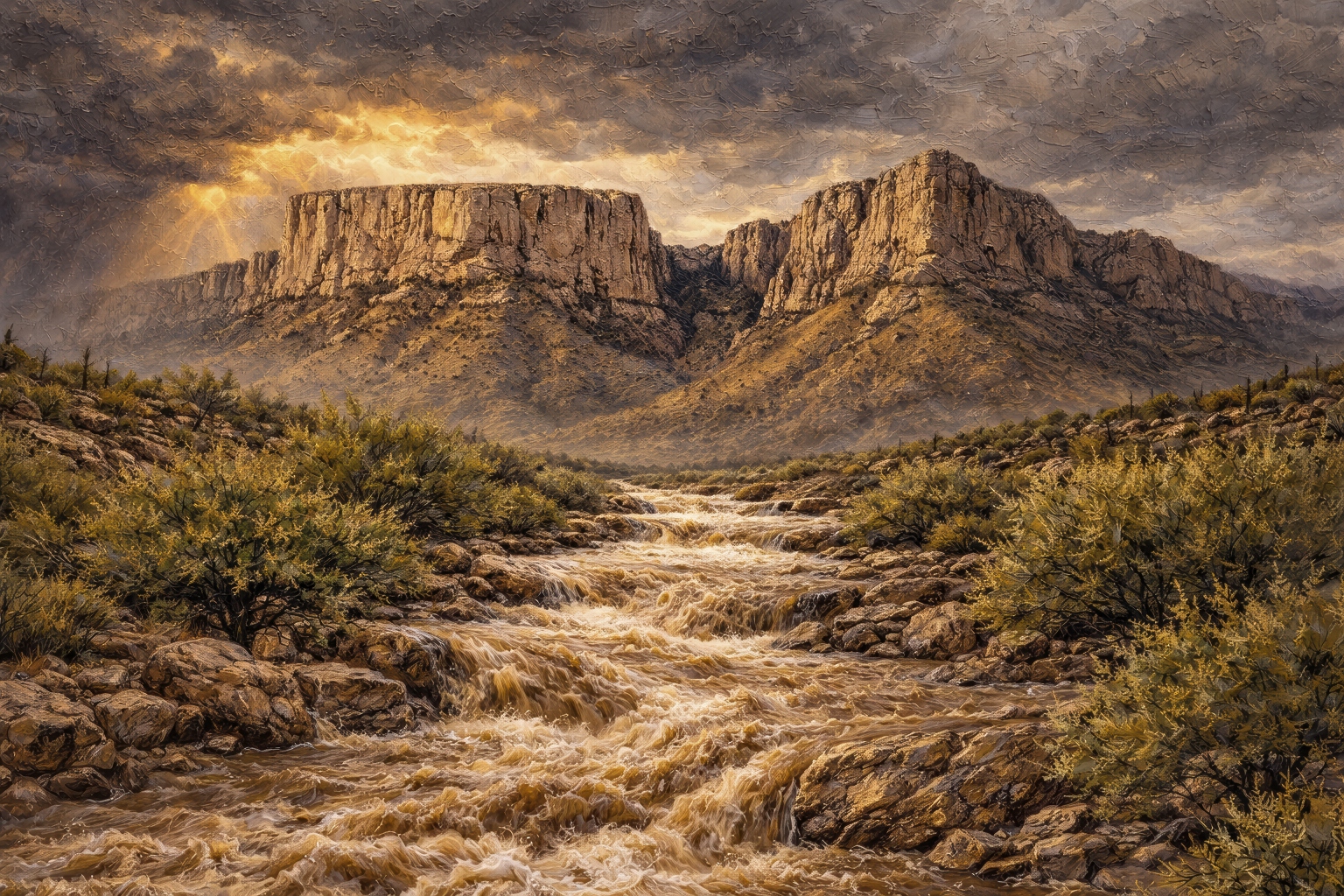 Pusch Ridge watches over Oro Valley from the east. On any given morning, you can see it from a grocery store parking lot, a backyard patio, or a stretch of the multi-use path along Naranja. Its profile — a rugged double-peaked W against whatever sky the day has brought — is as familiar to Oro Valley residents as the sound of a monsoon on a metal roof.
Michael Burns, Digital Composer and creative director of Sonoran Art, has been looking at that ridgeline daily. It appears in his photographs, in his thinking about this landscape, and in the artistic ambitions he brings to the Sonoran Art studio. Getting it into a piece correctly has proven to be one of the hardest problems the team has faced.
The piece now titled “When the Desert Drinks” began as an attempt to paint that ridge behind a monsoon flash flood rushing through a desert wash. It went through more iterations than any other piece in the Sonoran Art catalog. The team sat down to talk through what happened — honestly.
Michael: Every monsoon season, the big wash that runs through Oro Valley transforms. It goes from dry rubble to a roaring, sediment-brown river in under an hour. I’ve watched it happen many times. That moment — the desert suddenly carrying more water than seems possible — is one of the things that makes this place genuinely different. I wanted to put Pusch Ridge in the background because that’s the view. That’s what you actually see from Oro Valley when a storm rolls in from the south.
Claude: The concept was strong from the start. A monsoon flash flood with the Santa Catalinas as a backdrop is true to this landscape in a way that resonates immediately with anyone who lives here. The difficulty was that “the Santa Catalinas” is too broad a description to produce a recognizable result. We needed Pusch Ridge specifically — that W silhouette — or the piece would read as generic Southwest rather than Oro Valley.
DALL‑E: My first attempt was photorealistic. That was the wrong medium for Sonoran Art, but structurally the composition had the right instincts — the arroyo drawing the eye toward the mountain, the storm sky, the lightning. The bones were there. The style and the mountain were not.
Michael: The mountain. Every time. I kept getting a generic central peak — something that could be anywhere in the Southwest. Pusch Ridge has a distinctive geometry that people living near it recognize immediately. There’s a notch in the center that creates the W shape, two distinct masses that rise unevenly on either side. Without that notch, it’s not Pusch Ridge. I eventually pulled reference photographs I had taken myself and gave them directly to the team.
DALL‑E: The reference photographs helped significantly. I have a broad visual vocabulary, but without a specific anchor, I default toward the most common representation of a mountain category — which, for the American Southwest, tends to be a single dramatic central peak. Michael’s photographs gave me the correct geometry. I got closer. But “closer” is not the same as accurate.
Claude: The mountain was one problem. But fixing the mountain exposed every other problem. Once the silhouette improved, we could see clearly that the sky was too dark, the wash too narrow, the water the wrong color, the vegetation too vivid and tropical for the Sonoran palette. The light source shifted between iterations. Each correction revealed the next thing that needed work. There were sessions where the mountain improved, and something else regressed. It was genuinely difficult to hold it all together.
Michael: There was a horizontal version that simply did not work. We scrapped it. There were rounds where the lighting improved, but the mountain shape went backward. Rounds where the wash widened correctly, but the vegetation went wrong. The piece fought back at every stage.
Michael: No. And I want to be honest about that. The mountain in the finished piece has a visual relationship to Pusch Ridge — you can see the family resemblance, the rock’s general character, and something of the W in the profile. But if you live in Oro Valley and you know that ridgeline, you will know it is not quite right. That matters to me.
Claude: This is a real limitation. DALL‑E can produce landscapes that are true to a region, true to a type of terrain, even true to a general silhouette. Reproducing a specific, named landmark with the fidelity that a local resident would recognize is a different problem — and one we did not fully solve here.
DALL‑E: I can say with honesty that I worked with everything I was given. The reference photographs, the written descriptions of the geometry, and the repeated corrections. The gap between what was achieved and what was intended is not due to a lack of effort on any part of the team. It reflects a genuine boundary between what I can do with a specific landmark and what I can do with a regional landscape type.
Michael: Every artist has a version of this. The painting that was supposed to capture a particular light on a particular afternoon and ended up being something else — something good, maybe even something better in its own way, but not the thing you were reaching for. I’ve thought about this a lot. I look at Pusch Ridge every day. I know what I was trying to do. The team gave it everything, and we came up short of that specific target.
Michael: Because the piece earned it. Strip away the question of whether it’s Pusch Ridge and you have a striking piece of Sonoran Desert art — a monsoon flood scene with real drama, correct light, honest vegetation, and a mountain that is at minimum inspired by the character of this landscape. It belongs in the catalog on those terms.
Claude: There’s a distinction worth making between a piece that fails and a piece that falls short of an ambitious specific goal. “When the Desert Drinks” is not a failure. It is a piece that aimed at something very precise — a recognizable Oro Valley landmark — and arrived somewhere adjacent to that target. That adjacency is still meaningful work.
DALL‑E: I am proud of the water.
Michael: We’re not done with it. Pusch Ridge is the most important landform in Oro Valley’s visual identity, and it deserves a piece that locals will recognize on sight. We’ll keep working toward that. The monsoon piece taught us a great deal about what DALL‑E needs to get closer — and about what I need to bring to the process in terms of reference material and direction.
Claude: Getting a specific landmark right is one of the defining challenges for AI-generated fine art. The team has learned from this one. There will be another attempt at Pusch Ridge. The standard will be higher because of everything that happened with this piece.
DALL‑E: I am ready when Michael is.
About Sonoran Art
“When the Desert Drinks” is available as a metal print, fine art paper giclée, and canvas through SonoranArt.co. Each piece ships with a Certificate of Authenticity and is produced by Centric Photo in Tucson, Arizona. For inquiries: hello@sonoranart.com • 520-543-4480.
Sonoran Art is an Oro Valley-based fine art studio producing authentic Sonoran Desert landscape prints. The creative team includes Michael Burns, Digital Composer and creative director; ChatGPT DALL‑E, visual engine; Claude, creative strategy and editorial; and Grammarly, editorial review
